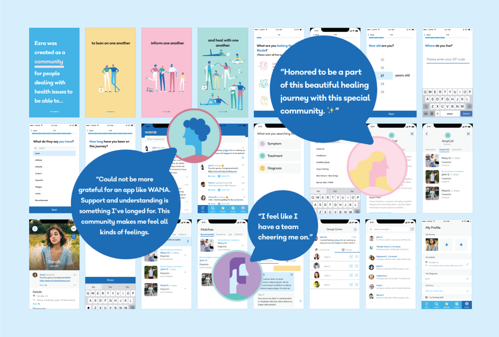
Wana
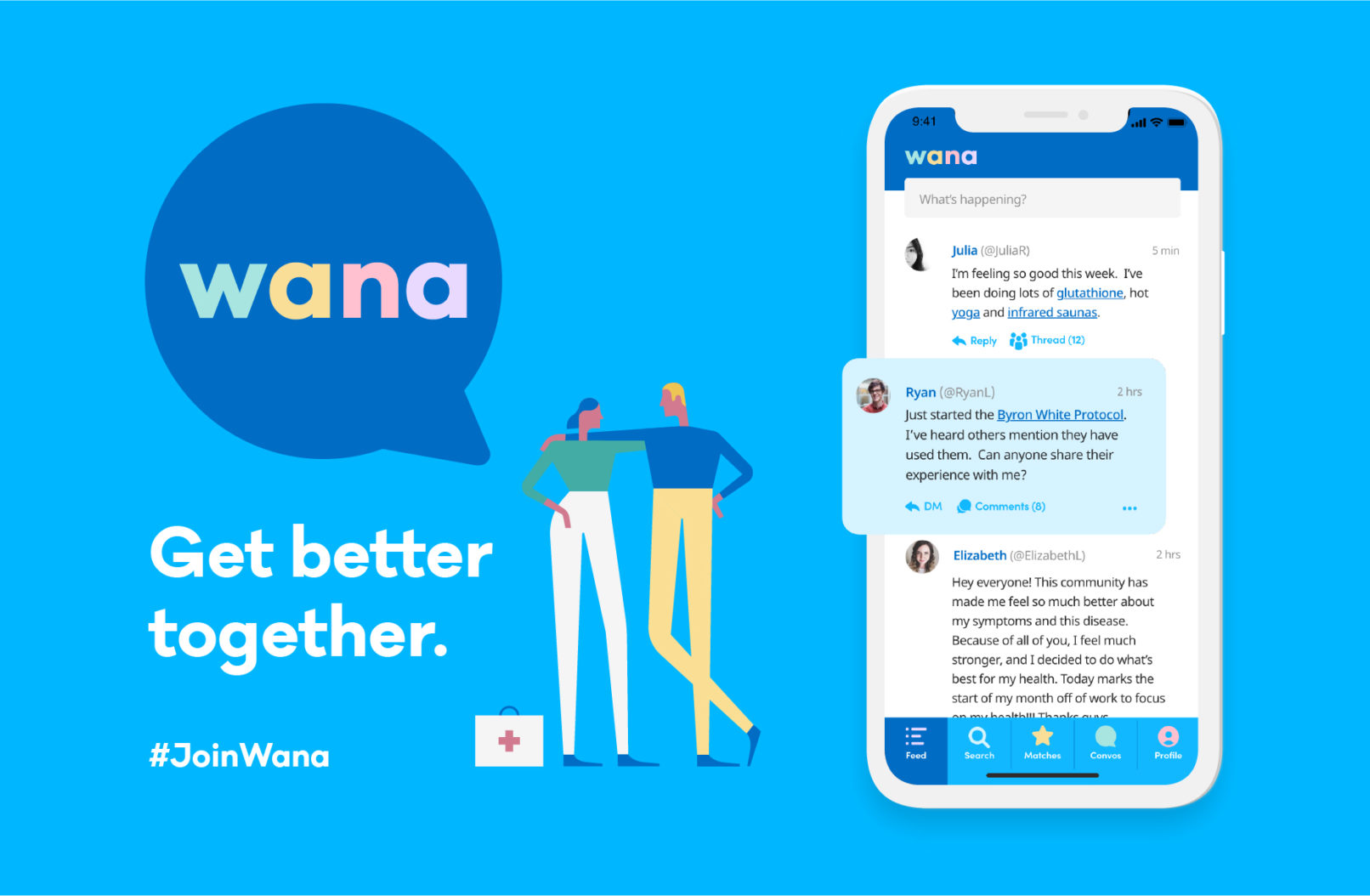
At Wana — We are not alone, my responsibilities were to reinvent the health community by creating an experience that included a safe space to talk, provide multiple ways to connect with others going through similar symptoms and diagnoses, and allow easy access to resources, bundled in a brand that gives people direction and hope.
The Research
200 million Americans (more than half the population) suffer from chronic disease.
Conventional medicine is not set up to handle chronic illness.
The risk of depression for people with chronic illness is about 2X that of the general population.
With 6 in 10 adults in the U.S. living with a chronic disease, patients are looking for places to ask questions, get answers, and learn about new treatments.
Product Strategy
MVP Features
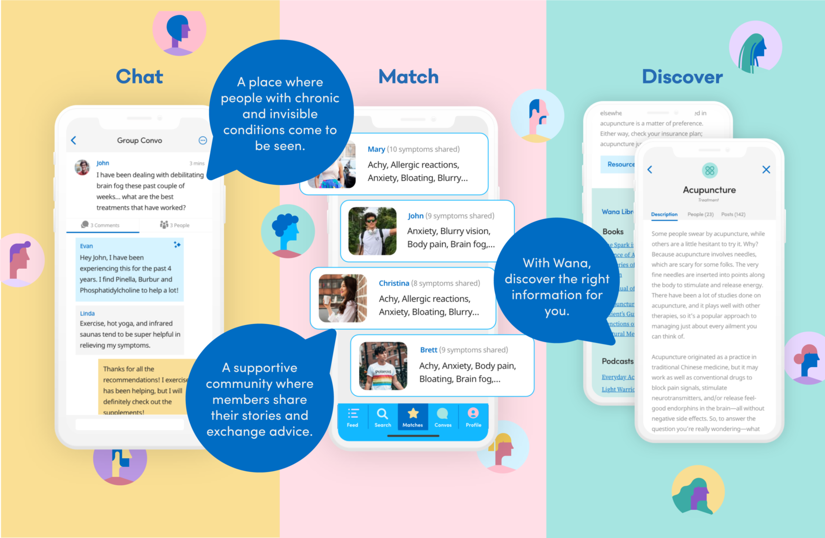
Based on the research, goals, and pain points, I worked with the shareholders to determine the following 3 core features and how the user experience would be:
A place to talk to others. Users can share what's going on their health journey and get support and suggestions from others in the community
A matching system where users are matched with other users going through a similar experience based on symptoms, diagnoses, and proximity so that if the connection is well met, users have the ability to meet in person.
A library of resources that included recognized symptoms, treatments, and diagnoses within the chronic illness community. These would also be linked throughout the feed and profile so users can read up on anything they have a question about.
Style Guide
Logo, Colours & Typography
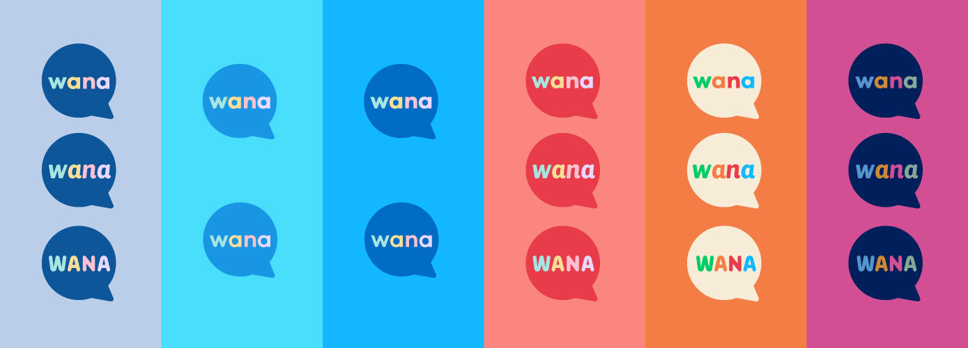
We developed a concept for the identity which nods to communication. The outcome depicts a speech bubble encompassing the wordmark that is inviting. The color exploration below aimed to be both informative and inclusive. We eventually landed on the 3rd color scheme as the blues denoted a seriousness, and the introduction of pastels brought in a lightness.
Styleguide
Illustrations
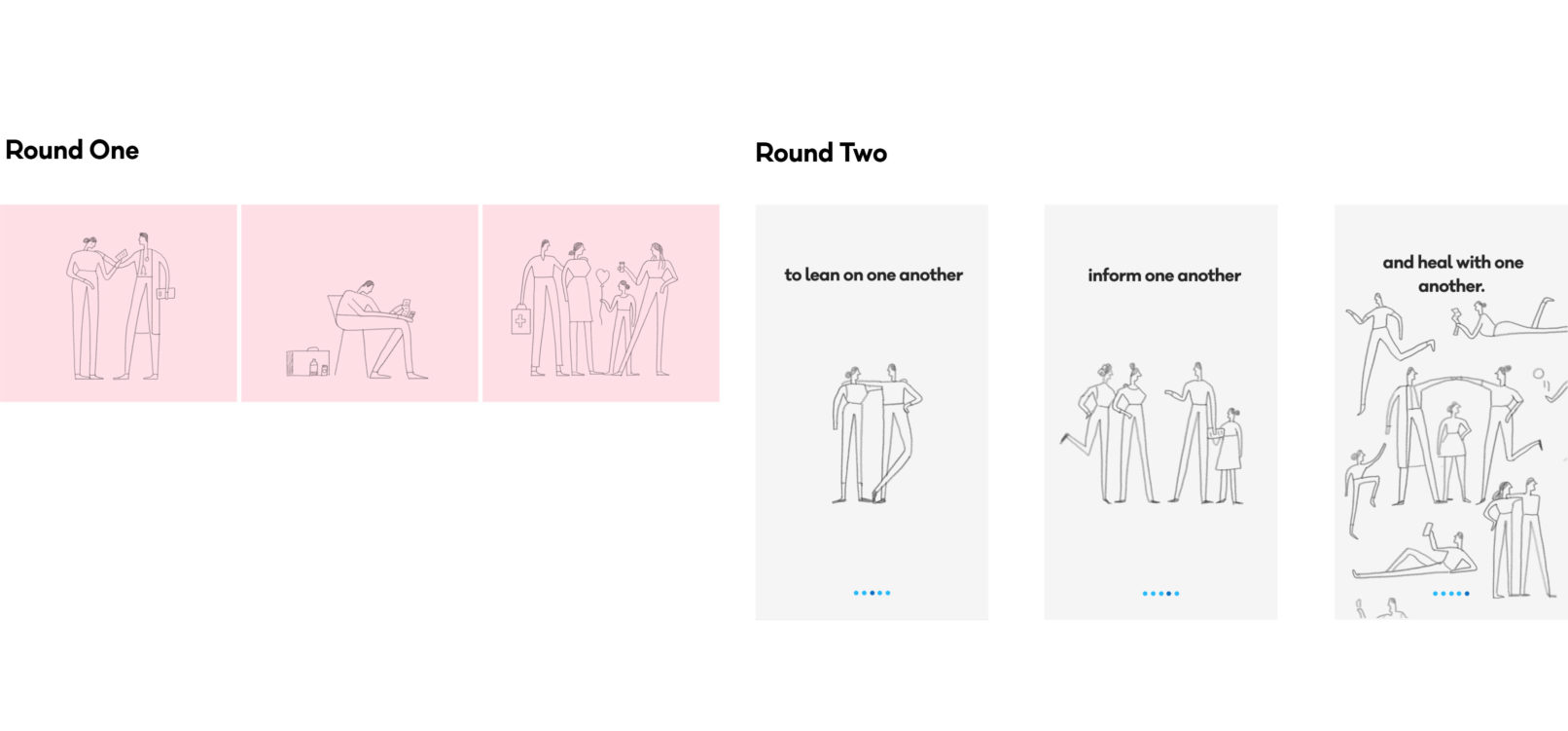
I had the pleasure of collaborating with Fran Labuschagne to create these illustrations. People with chronic illness are often left feeling alone and hopeless, and originally the illustrations conveyed this loneliness and we realized that we wanted to concentrate on conveying hope.
UI/UX

